| Explorations: Graphic Displays of Data |
3-D GRAPHS
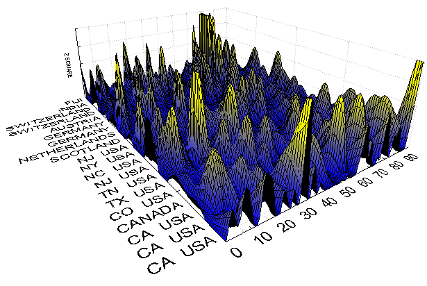
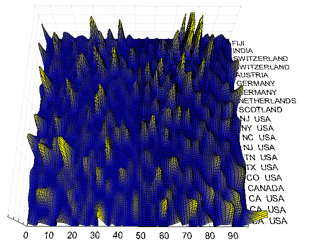
Topological Presentation of DataFor an interesting, and potentially informative display of the data for a day, The Z-squared values for each 15-minute block for each egg are used in a 96 x N-eggs array that forms the basis for a topological "map" of the REG activity for one full day (10 July 1999).
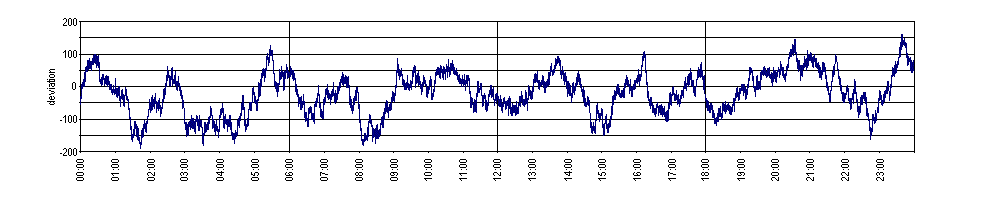
Time Series, 24 hoursContinuing the explorations, George sent the following on 21 July 1999. His accompanying description:Roger,
The attached .gif is an attempt to create a strictly time based graph with fixed degrees of freedom.
What you're looking at:
86,400 data points, one for each second of the day. The tiny .gif loses much of the graph's
Each data point is the result of the following manipulation:
The value is plotted. The process is repeated after advancing one second into the day. The bottom line is that each point is the composite deviation of the previous hour.
My hope is that large scale patterns (in Gaia's electroencephalogram) may be discerned.
And yes, this is the infamous Yugo bombing period. You'll have to let me know when I've
George Looks good to me, even without looking.
(July, 1999, RDN, Graphics by George deBeaumont).
|